Small Tweaks, Big Impact: Data-Backed Ways to Optimize Your Giving Form and Boost Conversions
Jun 2025 - READ IN 3 MINUTES

In today’s digital fundraising landscape, getting a prospective donor to your online giving page is only half the battle. The real challenge? Ensuring they complete their gift. Despite your best efforts to drive traffic, most visitors will exit without donating—leaving both money and momentum on the table.
With donor attention spans shrinking and competition for support rising, fundraisers can’t afford to lose prospective donors in the last mile. That’s where giving form design optimization comes in. By reducing key friction points on their giving forms, fundraisers can get more donors over the finish line.
In this two-part series, we’re offering tested strategies to help you streamline your online giving form and turn more visits into completed gifts. In part one, we’re honing in on key ways to remove friction from the donor experience on your giving form, and significantly increase your conversion rates. Let’s dive in.
Why Conversion Rates Matter
Fundraisers often lack the time or tools to monitor conversion metrics on their giving pages. But ignoring them comes at a cost. Even a small dip in conversion rates can lead to significant losses in potential revenue—both immediate and long-term.
At GiveCampus, our team has conducted extensive A/B testing on giving form design and functionality. These learnings have led to measurable increases in conversion and can be applied incrementally, without a full overhaul.
Before we dive into the fixes, let’s first unpack the reasons donors abandon their gift.
Why Motivated Donors Still Drop Off
A donor who lands on your giving form is already engaged. But many of them still choose to abandon the process—and most of the time, the issue is friction. Friction can take many forms:
⏱ Time. Every second matters. Delays in page load, manual address entry, or overly long forms increase the likelihood of abandonment. Even shaving off 10 seconds from the process can yield results.
🔄 Complexity. More fields and steps don’t equal more clarity. The longer and more complicated the journey, the more opportunities for the donor to exit before completing their gift.
❗ Error Messaging. We’ve all been there: you click “submit” only to get hit with a red error message. That brief moment of confusion can lead to lost conversions—especially on mobile devices.
🤹 Choice Overload. Offering too many (or too few) options—such as designations or payment methods—can overwhelm or frustrate the donor. Striking the right balance is key.
📱 Bad Mobile UX. With over half of all online donors accessing giving pages via mobile, a responsive, mobile-first design is no longer optional—it’s essential.
Five Giving Form Optimizations That Can Dramatically Improve Conversion
Based on extensive A/B testing and donor behavior analysis, GiveCampus identified five common friction points in the online giving experience. These aren’t just design preferences—they’re barriers that prevent donors from completing their gift.
Here’s a breakdown of the friction, the fix, and the measurable impact.
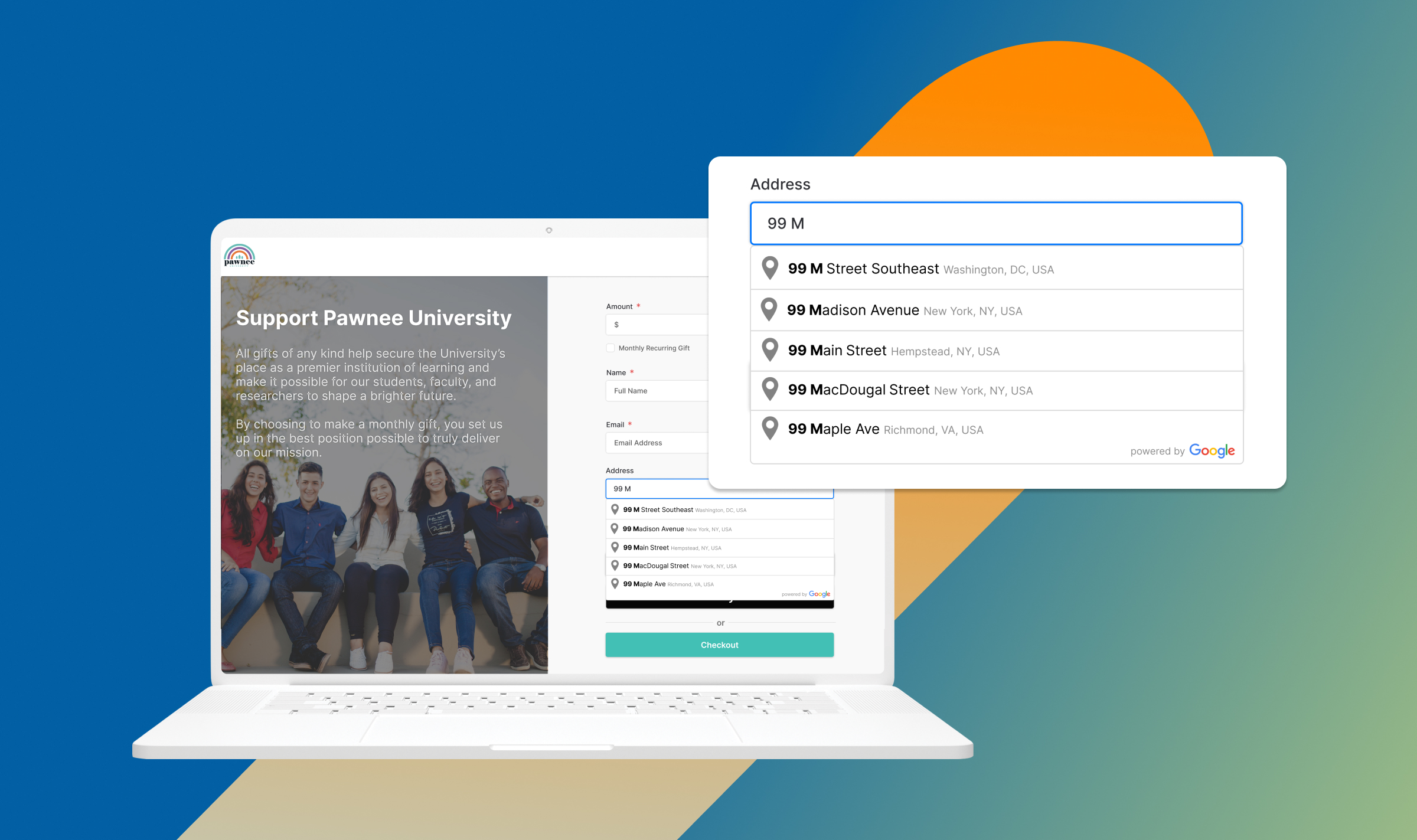
1. Address Entry: Manual Typing Slows Donors Down
The Friction: Manually entering an address—especially on mobile—is tedious. It increases the likelihood of typos, slows down the process, and creates a point of frustration that may cause donors to abandon the form altogether.
The Fix: GiveCampus implemented Google Address Autocomplete. As soon as a donor types a few characters, they’re presented with matching options. One tap fills out the field, reducing both errors and effort.
The Result: Test groups completed the pre-payment form 11 seconds faster, yielding a +0.24 percentage point increase in conversion. For donors, every second saved translates to a smoother, more satisfying experience.
2. Terms of Service Checkbox: A Small Box with Big Consequences
The Friction: GiveCampus found that one of the most common user errors is forgetting to check the “Terms of Service” box. This triggers a red error message at the bottom of the form—confusing or frustrating donors, especially first-timers. Our data showed that once donors hit this roadblock, they were 13% less likely to complete their gift.
The Fix: In regions where it was legally permissible (non-GDPR countries and U.S. states outside California), we removed the requirement to check the box entirely. Donors are still informed of the terms, but no extra action is needed.
The Result: A clean, streamlined form without that extra speed bump led to a +1.55 percentage point increase in conversions.
3. Payment Uncertainty: “Can I Pay the Way I Want?”
The Friction: Donors who don’t see their preferred payment option (e.g., Venmo, PayPal, Apple Pay) early in the process may feel uncertain or frustrated. In fact, 42% of U.S. consumers abandon a checkout process if their payment preference isn’t available.
The Fix: We moved digital wallet buttons (Venmo, PayPal, Apple Pay) from the final step to the pre-payment form. This provides immediate reassurance that their preferred method is supported—reducing anxiety and friction.
The Result: This change produced a significant impact: a +2.93 percentage point increase in conversion. Seeing a familiar payment method upfront creates trust and clarity.
4. Form Overload: Collecting Too Much Information, Too Soon
The Friction: Non-essential fields—like phone number or employer—add friction. They take time to complete, and their relevance isn’t always obvious to the donor in the moment. Each additional text field increases completion time and risks donor drop-off.
The Fix: We moved optional fields to a post-payment form. Donors are first asked for the bare minimum to process the gift, then given the opportunity to update contact details afterward.
The Result: This small shift led to a +2.4 percentage point increase in conversion. Fewer fields upfront reduces cognitive load and speeds up giving.
5. Non-Responsive Design: Ignoring the Mobile Majority
The Friction: More than 50% of donors use mobile devices to access giving pages. Forms that are simply “mobile-friendly” (i.e., desktop designs made smaller) create usability issues like tiny text, hard-to-press buttons, and awkward scrolling.
The Fix: We implemented a mobile-first design: forms are built first for small screens, then adapted for desktop. Elements are spaced intuitively for thumbs, fields are optimized for autofill, and buttons are easy to tap.
The Result: The mobile-first design produced a +2.33 percentage point increase in conversion. At some schools, the impact was even greater. At the University of Virginia, donors were 33% more likely to give using the mobile-first version.
The Cumulative Impact
These five micro-optimizations add up. When combined, they drive an 8.78 percentage point lift in conversion, which equals:
- 87 more completed gifts for every 1,000 visitors!
- Nearly $35,000 in additional revenue assuming an average gift size of $400!
Conclusion: Small Changes Can Add Up to Big Results
In the competitive world of digital fundraising, small improvements to your giving form can deliver transformational outcomes. By reducing friction in key areas—like address entry, form length, mobile usability, and payment clarity—schools can significantly boost conversion rates and ensure that more visits lead to completed gifts.
The strategies shared here aren’t theoretical—they’re proven, data-backed optimizations that remove barriers and make giving easier for every donor.
Want to put these strategies into action?
Explore GC Online Giving to see how our platform empowers schools with customizable forms, smart ask amounts, and modern payment options—all designed to boost donor conversion and gift size.
Plus, up next in Part 2, we’ll explore how personalization and intelligent tools can further enhance your giving form—driving even greater impact and deepening donor engagement.
Explore More GiveCampus Content
Tour GiveCampus Solutions
Explore GiveCampus on your terms. Dive into self-guided Navattic tours of core fundraising and engagement tools—online giving, events, volunteer management, gift officer workflows, student fundraising, and more—to see how the full platform works together to drive impact.
Alumni Event Best Practices
Explore practical and creative ways to modernize the registration experience, increase attendance rates, factor fundraising into events, and more! See how institutions like Ohio University, Blair Academy, and the Westminster Schools are leveraging technology to host fun and meaningful events that deepen alumni relationships.
CASE Insights on Donor Pipeline
Explore how advancement professionals are building donor pipelines, prioritizing leadership giving, and using AI to drive results in this joint 2025 report from CASE Insights and GiveCampus.